
Building a consistent visual language costs money. While typography and color palettes are straightforward to standardize, iconography behaves differently. A typical SaaS platform or mobile app requires hundreds of unique symbols, from standard navigation elements to niche industry-specific representations.
Most organizations face a difficult choice: maintain strict visual consistency by hiring a dedicated iconographer, or burn weeks of design time building assets in-house. Icons8 Icons approaches this problem differently. It doesn’t act as a chaotic marketplace. Instead, it functions like an outsourced design department adhering to rigid style guides.
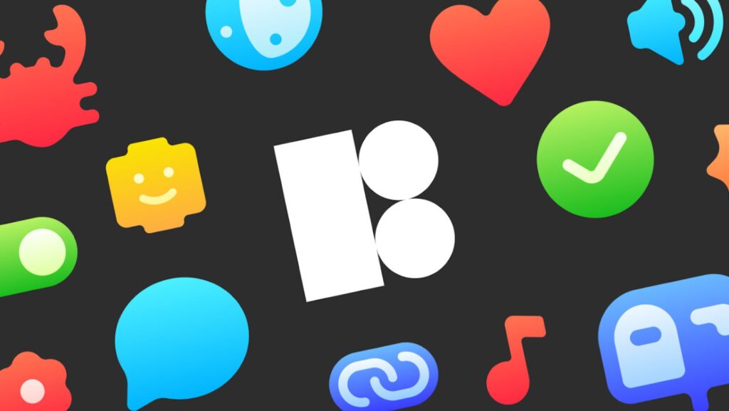
The Architecture of Consistency
Volume is a factor with over 1.4 million icons, but organization defines professional workflows. Most icon sites operate as aggregators, hosting packs from thousands of distinct designers. Visual dissonance follows immediately. The line weight of a “settings” gear from one author rarely matches the “user” profile icon from another.
Icons8 produces the vast majority of its assets in-house under strict guidelines.
The library splits into over 45 visual styles. A team building a native iOS application can select the “iOS 17” style (available in Outlined, Filled, or Glyph). This single category contains over 30,000 icons. When a designer needs an obscure symbol-perhaps a specific database interaction or a medical instrument-it exists in the exact same line weight, corner radius, and aesthetic as the rest of the interface. Teams avoid the common trap of starting with a free open-source pack and hitting a wall when it lacks specific assets.
Scenario: The Cross-Platform Migration
Imagine a product design team porting a successful web dashboard to a native Windows 11 application. The web version uses “Material Outlined” to align with Google’s design principles. Customization is heavy, with over 120 unique icons across menus, data tables, and settings pages.
A traditional workflow requires the lead designer to audit every icon. They must redraw them to match Microsoft’s Fluent Design system. This involves changing stroke widths, adjusting corner rounding, and altering the metaphorical representation of actions to match Windows conventions.
Icons8 shifts the workflow from creation to selection. The designer opens the Figma plugin. Since the library maintains parity across styles, they map their current asset list to the “Windows 11” style pack (containing 17,000+ icons). No need to check stroke width; the library enforces the guidelines. The team swaps the assets. The new app feels native to the OS without anyone drawing a single vector.
Scenario: Marketing Agility for Non-Designers
Marketing teams rarely work inside Figma or Sketch. A content manager building a presentation deck or landing page needs high-quality assets immediately. They often lack access to vector editing software.
Picture a marketing lead building a pitch deck. They need visualization for abstract concepts like “cloud security,” “scalability,” and “team collaboration.” These icons must match the company’s brand color, a specific shade of navy blue.

Downloading black PNGs and tinting them in PowerPoint rarely looks good. Instead, the manager uses the in-browser editor on the Icons8 website. They select the “Fluency” style for a 3D look suitable for presentations. Before downloading, they input the company’s HEX code into the recolor tool. They add a square background with rounded corners directly in the editor to create a uniform “app icon” look for the slides.
They download the assets as 1600px PNGs-high resolution for 4K displays-and drag them into the deck. The design team stays focused on product work, yet the results remain on-brand.
A Developer’s Morning Workflow
Frontend developers often bypass the design phase for minor assets to keep sprints moving.
At 9:30 AM, a developer realizes the new “Success” modal is missing a visual indicator. The design ticket didn’t specify one. Waiting for a designer to open a ticket would stall deployment. They open the Pichon Mac app-a desktop client for the library-and search for a check icon.
Since the project uses a minimal aesthetic, they filter by “Simple Small.” They find a suitable checkmark, but it’s black. Right inside the app, they toggle the color to the project’s success-state green.
They drag the icon directly from the app into their IDE (VS Code). The tool drops the SVG code into the HTML file automatically. Later, for a loading state, they need something dynamic. Returning to the library, they filter for “Animated” and grab a JSON Lottie file of a spinning loader. Pasting the CDN link directly into the code lets them test it immediately. The unblocking process takes less than three minutes.
Comparing the Alternatives
Understanding where this tool fits requires looking at the spectrum of icon solutions.
In-House Design: The gold standard for uniqueness. If a brand needs a proprietary icon set reflecting a specific curvature or voice, building it in-house is the only way. But it is expensive and slow. Maintaining it requires a dedicated resource.
Open Source Packs (Feather, Heroicons): Excellent for early-stage startups. Free and generally high quality. Coverage is the limitation. A pack might have 300 icons. As soon as a product requires a “drone delivery” or “biohazard” icon, the pack fails. Consistency breaks.
Marketplaces (Flaticon, Noun Project): Immense variety exists here because they crowdsource from thousands of designers. But they lack strict style governance. Finding 50 icons that look like they belong to the same family is difficult. Users often end up manually editing stroke widths to force consistency.
Limitations and When to Avoid
Every tool has drawbacks. The most significant friction point here is the paywall for vector formats. PNGs up to 100px are free (with attribution), but professional design work demands SVG. This format is locked behind a paid subscription for most categories, excluding “Popular,” “Logos,” and “Characters.”
Universal applicability can also be a double-edged sword. Icons designed for everyone can feel generic. If a brand’s identity relies on a gritty, hand-drawn aesthetic or avant-garde geometry, these polished styles might feel too corporate.
Finally, the “Recolor” feature treats the icon as a flat object. You cannot easily recolor specific parts of a complex, multi-colored icon within the browser. It usually applies a wash or changes the primary color. Detailed multi-color editing requires downloading the SVG and opening Illustrator.
Practical Tips for Power Users
Use Collections as Staging Areas
Don’t download icons one by one. Drag candidates into a “Collection” as you browse. Once you have a set, apply a bulk recolor to the entire collection. Download them all at once as a sprite sheet or font. If you change your mind about the primary brand color later, updating the whole set takes seconds.
Leverage the Request Feature
If a specific icon is missing, use the Request feature. Unlike platforms where requests vanish, Icons8 operates on a voting system. If a request gets 8 likes from the community, it enters production. Teams with niche needs and a few weeks of lead time find this strategy viable.
Understand Simplified vs. Editable SVG
By default, the platform offers “Simplified” SVGs. These are optimized for web performance, with paths merged and cleaned. If you plan to animate the icon yourself or modify a specific anchor point, uncheck “Simplified” in the download settings. This provides the raw, editable paths.
Utilize the CDN for Prototyping
Developers can use direct CDN links for rapid prototyping. This avoids cluttering the project folder with assets during the experimental phase. Inject the icon, style it via CSS, and only download the local asset when the product moves to production.